A lesson I am proud of is my license plate data activity, intended for a Statistics classroom. It worked out well for me, as a course introduction, to discuss the course syllabus the same time I was discussing this ongoing project. It would be practical as well to use this as an end-of-course project to assess a combination of objectives from the Statistics repertoire.
The project exploits our state's license plate formatting, with three digits and three letters separated by a space (pre-2009 and post-2009 swapped orders with one another), as shown in photos below.
The project exploits our state's license plate formatting, with three digits and three letters separated by a space (pre-2009 and post-2009 swapped orders with one another), as shown in photos below.
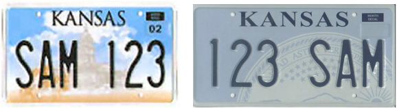
pre-2009 (at left) and post-2009 Kansas standard license plate sample artwork.
My students' first class assignment was to come return on the second day of class with 50 randomly-collected 3-digit license plate numbers from Kansas vehicles. This prompt was addressed later in the course when we discussed sampling types as an example of quota sampling.
As the course progressed, students were able to comprehend the project requirements, but I felt that giving them the project rubric and instruction sheet (last used for a course in Summer 2010, f.y.i.) with those terms included prior to investigating them in class gave them a first glance at some of the terminology to be used in the near future. When I started discussing those topics in lecture, they had already heard it and treated the class discussion as if we'd already had it.
Potentially overwhelming to students was the fact I made a demonstration to show the incorporation of all the required elements of the project in one place. This created something they could refer back to later in the course, as well as a measuring stick for them to see how their display(s) compared with mine. See the artwork below.

This shows the demonstration version of the final product I showed students to indicate required elements of the project.
Part of the reason I like to submit this among my #Made4Math comrades is that I was able to score a sweet deal on foamboard at a hobby store early on in a summer semester when I taught the course where this project was assigned. I provided each student with a piece of 20-inch by 30-inch foamboard to level the playing field from day one. Some students handwrote all elements of their project on the board, others printed individual elements out and glued them to the board, and one (a graphic design major) created his entire project in Photoshop and took the file to Kinko's to have the whole thing printed to fit the foamboard, then rubber cemented into place. To each their own.
Along with the list of required information students had to include with their poster display, there were three other elements described, of which they were to choose TWO to include on their own project. They were:
Histogram Hysteria: A frequency histogram AND relative frequency histogram for the data set
Of course, if students elected to include all three of these elements, I made sure to grade accordingly, but warned them about the use of space on their poster and how they would balance the space. One place where students commonly lost points was for lack of labels on their diagrams because they did not take enough due diligence with Excel to correctly format labels (or they just made sure to cut them off and hand-write them correctly in place).
Along with the list of required information students had to include with their poster display, there were three other elements described, of which they were to choose TWO to include on their own project. They were:
Histogram Hysteria: A frequency histogram AND relative frequency histogram for the data set
- These displays must be separate graphs (not just a matter of re-labeling the vertical axis), but include an appropriate title and labels for each axis.
- The displays must have different values for the class intervals (i.e. one histogram done with class intervals of 50, the other with class intervals of 100, or a similar way of distinguishing the data). Keep in mind that class intervals typically categorize our data into somewhere between 5 and 20 classes.
- One graph could show the percent of the sample that made up each category; the other could show the frequencies for each category.
- The graphs must have different class intervals.
- The State of Kansas v. MATH 225, et al: Construct a boxplot for our data set on the same set of axes as a boxplot for the “theoretical distribution” for our target population (what the boxplot would look like if license plate numbers were evenly distributed statewide).
- Comparative Boxplots: On the same set of axes, sketch a boxplot for our data set as a whole, as well as an individual boxplot for each individual’s data in the class (and thank your lucky stars that the class size was manageable for this task, instead of a class of 30 people). For anonymity, it would be best to label individual’s as “Student 1, Student 2, Student 3” instead of using individual’s names.
Of course, if students elected to include all three of these elements, I made sure to grade accordingly, but warned them about the use of space on their poster and how they would balance the space. One place where students commonly lost points was for lack of labels on their diagrams because they did not take enough due diligence with Excel to correctly format labels (or they just made sure to cut them off and hand-write them correctly in place).
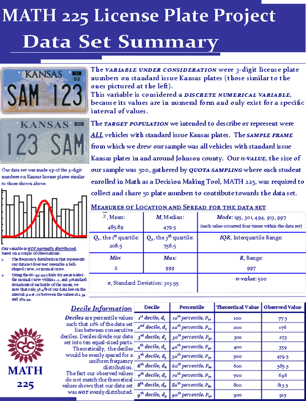
The sample summary page I created.
While I'm certain there are inconsistencies in the language used from one Statistics course to another, I feel it critical to give insight to the required elements students were to include in their poster project submissions. Here goes:
- The variable under observation (where did our data come from)
- Classify it as a Numerical or Categorical Variable, as well as whether it is Discrete or Continuous, if necessary.
- The target population
- The sampling frame
- The sampling method
- The N-value, n-value in our case (since we only used a sample instead of the population of plates)
- The measures of location for the data set (mean, median, and quartiles, as well as the mode, if it exists)
- The measures of spread for the data set (including the range, interquartile range, and standard deviation)
- A 5-Number Summary of the data set (this does not have to be included all in one place, but as long as all five values are identified somewhere on the project, that is acceptable)
- Identify the deciles of the data set (10th, 20th, 30th, 40th, … 90th percentiles).
- A short description as to whether the variable is normally distributed and what indicator(s) led you to your conclusion. Most importantly, a reference to whether a bar graph for our data is mound-shaped (bell-shaped) would be an acceptable argument as to whether the data is normally distributed overall.
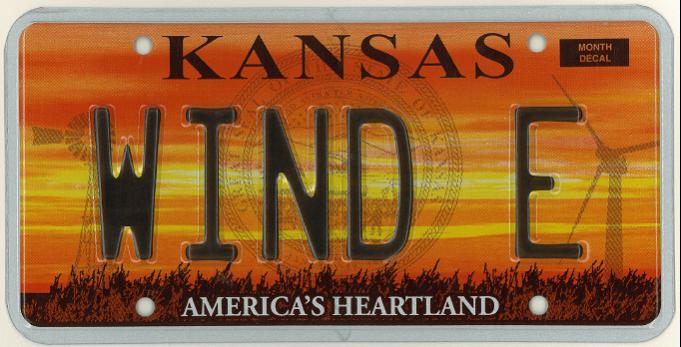
The plate I received from the State Department of Revenue, after bragging up this lesson.
One of the best payoffs of this lesson was in the midst of my quest to acquire an educational wind turbine on our high school's campus, as the state of Kansas changed the artwork in the background of the personalized license plates issued. A sunset over a wheat field cast out silhouettes of an old-fashioned windmill customary to our state on one side and an industrial-sized wind turbine, as is becoming commonplace in many parts of Kansas.
What a great time to seek out a sample license plate to help introduce this project in class, showing just what 3-digit numbers students were to collect! I enthusiastically contacted the State Department of Revenue (do a Google search to see how many results you have for that phrase; I'm pretty sure I just broke the shutout on that search) to see the potential of getting a default "SAM 123" plate or similar plate being available. I had seen in the past where demo copies of such plates were available for $7-$12; a nominal fee, I felt, for a great lead-in to this project.
To my surprise, the response I received was more than supportive, being met with enthusiasm that rivaled my own to the tune of "SURE! Actually, since you are using the plate for educational purposes, let us know what you'd like it to say, and how many copies of it you would like to be sent to you. Oh, and we'll do it at no cost, too!" Forgive me for paraphrasing the Department of Revenue's response. I hesitantly requested four plates (one for myself, my building principal, assistant principal, and district superintendent) saying "WIND E" to correlate with the WIND E CITY logo I had been using along with all the wind turbine application documents I'd created.

Original artwork created by Garrett Cleveland, EHS Class of 2012.
So, armed with the support of the state Department of Revenue and enthusiasm and curiosity oozing from the majority of my students, I recommend this project to any teacher whose state happens to have a license plate format that permits its incorporation into their classes.
I have modified it to use with my high school students with convenience sampling, using all the cars in our high school parking lot, using Google Earth to assign them cars from a certain "zone" of the parking lot within their particular class period.
WORD OF CAUTION: If using this with your students, supervision can become an issue. My campus was small enough I could supervise all students from one location, but this could leave you open to having your responsibility and classroom management stretched and highly visible in an outdoor environment.
Please let me know your comments, suggestions, critiques, and curiosities towards this project. I enjoyed putting it together, and equally enjoy sharing it with others.
--Keltner--
 RSS Feed